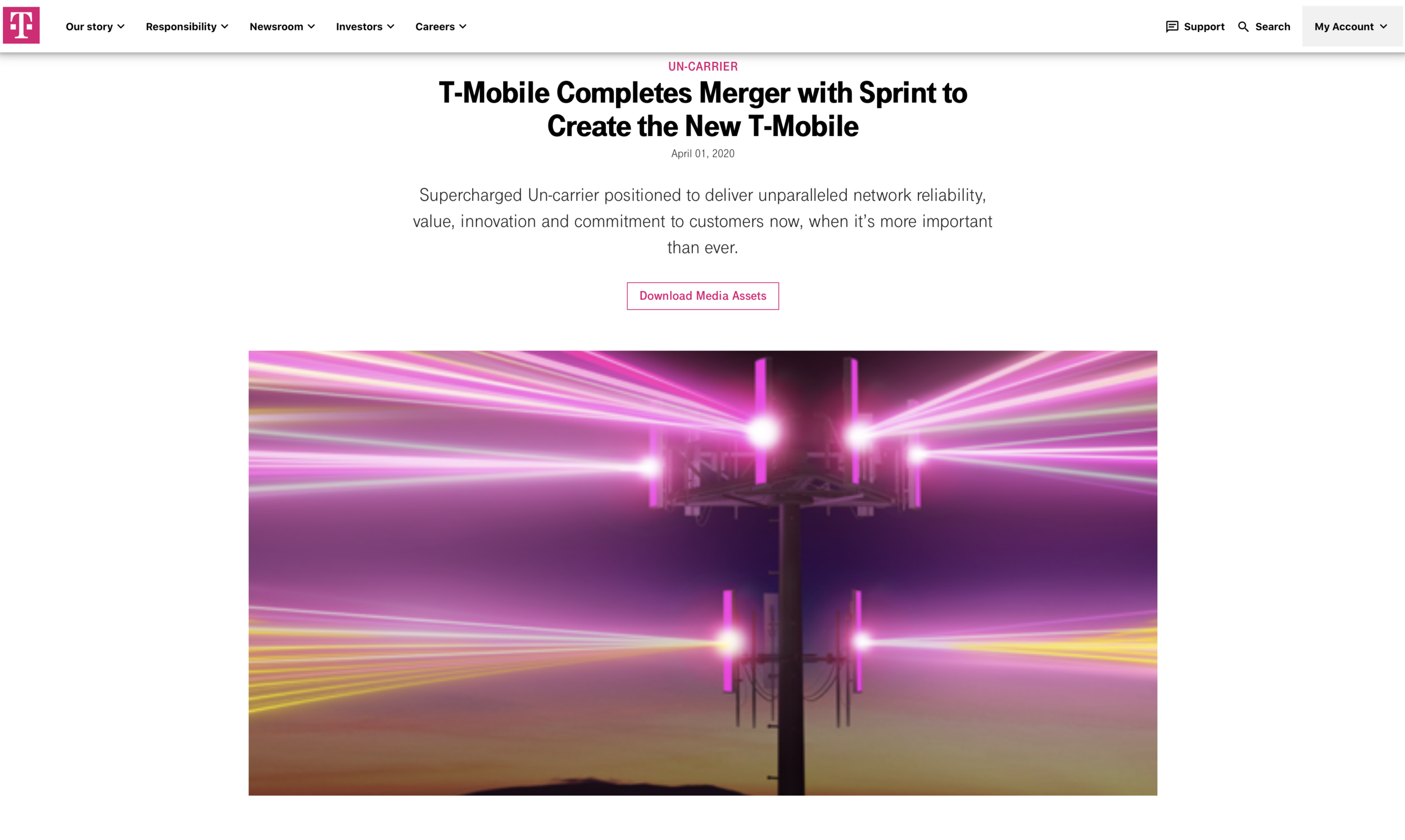
Creating The Merge
The project was an exercise in expressing not just the merging of two companies but their philosophies as well. What does it look like when one company as represented by a cell tower overtakes another but is stronger for it because both companies are successful, not because the other company is weaker. That is the sentiment we tried to wrap our heads around in executing this ask.
The original deliverable was an animation for a Times Square billboard. Something that illustrates the T-Mobile/Sprint merger in an instantly recognizable, bold, and exciting way. Then - Covid-19 hit and the Safer at Home order took place. We had to learn to communicate around not just a demanding client/vendor dynamic, but the mass office transition for humans and project deliverables with rapidly changing campaign directions. The developing climate pushed our delivered product into a multi-use one including billboards and in-store graphics assets.
Achieving a wow moment in something meant to be seen on a large scale was a priority but designing what symbolized the historic merge was paramount. That said, the delivered animation was still used in numerous ways but ultimately serves more as a prototype or benchmark for new T-Mobile designs. It was exciting to participate in the evolution of this highly recognizable brand and uplift the visuals.